Visual guide to income inequality
October 26, 2010 — Data visualizations can be powerful tools for bringing to life basic facts about how a society is operating. We at Remapping Debate believe that those visualizations are particularly effective in illustrating change (or lack of change) over time.
When only current data are looked at, there is a tendency — regardless of whether those data paint a flattering or disturbing picture —to assume that there is little to be done to influence them.
When, on the other hand, a historical series is presented, it becomes impossible not to ask questions: Why was it different in the past? Was greater importance given to values that are today assigned a lesser role? Are there policy options available now?
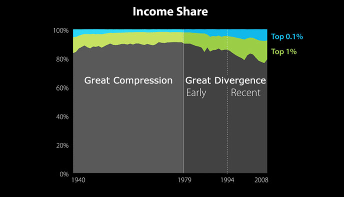
This chart appeared in Slate’s “The Great Divergence in Pictures: A visual guide to income inequality.” (Data source: Thomas Piketty and Emmanuel Saez. Chart by Catherine Mulbrandon of VisualizingEconomics.com.)
Slate’s recent slide show, The Great Divergence in Pictures: A visual guide to income inequality, is a good example of how “dry data” can be presented in a compelling fashion, forcing questions about policy choices to the fore.
Catherine Mulbrandon and Timothy Noah put together a series of 10 visualizations. The first, pictured to the left, gives an overview of change in income share of the top 0.1 percent and top 1 percent of the population in the period 1940 to 2008, with those shares lessening in the “great compression” to 1979, and then growing in the subsequent “great divergence.”
Additional slides hone in on the growing ratio of income taken by the top 20 percent as compared with the bottom 20 percent of Americans, and provide further detail on how the share of the top 1 percent has more than doubled since 1973, and how the share of the top 0.1 percent has quadrupled since 1973.
Breakdowns of earnings ratio by gender and by race are among the materials also provided.
Remapping Debate has itself begun to experiment with data visualizations in the area of income inequality, commencing with this week’s modest attempt to look at comparative data (U.S. versus selected other industrialized nations over time), incorporate both a broad measure of income inequality and specific information on top income status in the same chart, and provide for a basic level of interactivity.
We think this is an area ripe for further visualizations, and we applaud Slate’s effort.