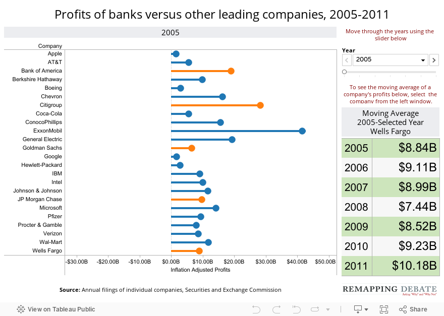
Mar. 7, 2012 — There has been a lot of reporting in recent weeks about how big banks have fallen on hard times. One would be forgiven for getting the impression that these banks are not doing much better than barely scraping by. But the data tell another story (all data are adjusted for inflation to 2011 dollars).
We looked at annual filings of two dozen leading companies, including five big banks, for the period from 2005 to 2011. In the interactive graphic below, the initial (2005) view of each company’s profit is represented by a circle at the end of a line (banks are shown in orange; other companies are shown in blue). As you click the the years, a trail is created. The bold circle represents the profit for the selected year; circles in “shadow” represent profits for other years. The range of profit for the period (from 2005 to the year selected) is represented by the entire line (both the portion that is bold and the portion in shadow).
By clicking on a company, the panel on the right depicts a moving average of that company’s profits. The box for 2005 represents only that year. The box for 2006 represents the average of 2005 and 2006. The box for 2007 represents the average for 2005 through 2007. And so on.
In 2011, for example, the profits of Citigroup, JPMorgan Chase, and Wells Fargo each exceeded the profits of Google. The average profit from 2005 to 2011 for Apple was less than that for Bank of America, JP Morgan Chase, and Wells Fargo.
When looking at the moving average for the banks, only Bank of America has had its moving average go down each year (although it still earned an average of close to $10 billion a year for the seven-year period). JP Morgan Chase’s moving average has gone up every year since a 2008 low, and its 2011 profits were almost double what it earned in 2005. Wells Fargo’s moving average has gone up each year. Citigroup, saddled with enormous 2008 losses, is still earning less than it did before the crash, but its moving average has gone up for the last two years based on profit of approximately $11 billion in both 2010 and 2011. Goldman, hurt by a subpar 2011 (profits of $4.4 billion), has a 2005-2011 average $1.4 billion below the 2005-2007 peak (a difference of a little less than 14 percent).