June 24, 2011 — While life expectancy in the country as a whole has continued to rise steadily for the last twenty years, a new study shows that life expectancy for women has actually declined during this period in 313 U.S. counties, most in the Southeast, the Southern Midwest, and Appalachia. Life expectancy for men, by contrast, only declined in six counties (although the study did find that men in these same areas tended to have worse outcomes than men elsewhere). See the full story, “Life getting shorter for women in hundreds of U.S. counties”.
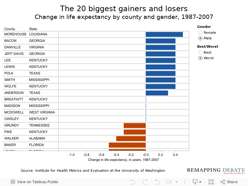
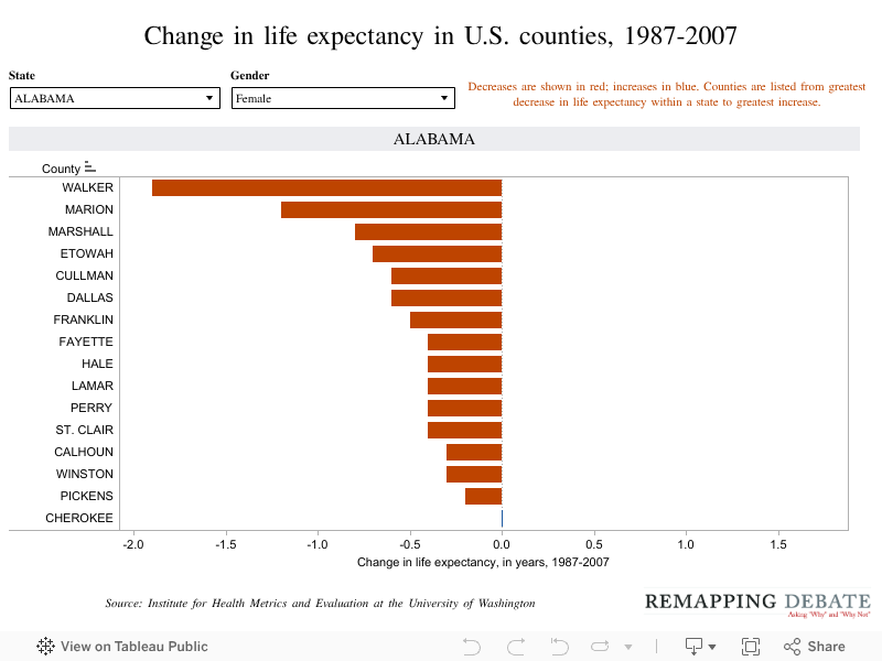
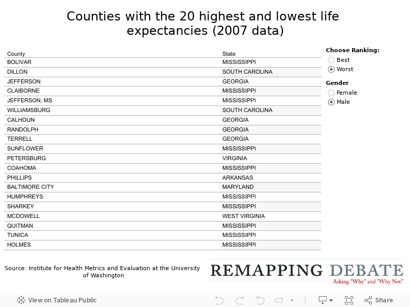
The graph on this page shows the counties that have done best and worst in terms of changes in life expectancy in the period from 1987 to 2007. Data is available separately for men and women. On page 2, data on changes in life expectancy (again, separately available for men and women) are presented for every county in the United States (organized by state). On page 3, we have a chart that shows that counties with the highest and lowest life expectancies as of 2007.