Comparative income inequality, U.S. share of income for wealthiest (a work in progress)
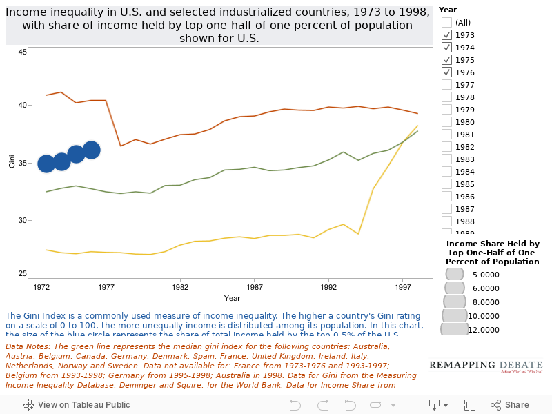
October 26, 2010 — The chart on this page shows U.S. income inequality over time as compared with that of selected industrialized countries. The size of each year's blue dot gives a visual representation of the share of income held by the top-half of one-percent of the U.S. population. The reason that this chart ends with 1998 data (instead of including the substantial 1999 to 2008 data that we have) is that some of the data sources have changed, causing some discontinuities that are artifacts of differing ways of measuring income inequality. The chart on the next page shows the post-1998 data (albeit for a somewhat modified set of comparator countries). We welcome suggestions on how to harmonize or supplement these more recent data.
<
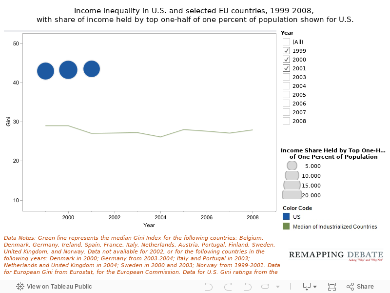
This chart shows the income inequality in the U.S. as compared with the median income inequality level of selected Western European countries in the period 1999 to 2008, with the exception of 2002 (for which only very limited Western European data were available). The size of each year's blue dot gives a visual representation of the share of income held by the top-half of one-percent of the U.S. population.