December 21, 2010 — Data from the Social Security Administration’s “net compensation” reports derived from wage income reported on W-2’s provide a revealing look at how income is distributed in the United States (although, since non-wage income is not reported, high-end income is still understated).
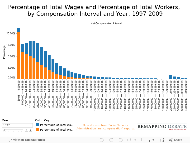
In the first chart, each income band has a single bar showing the workers in the band as a percentage of all workers (the orange part) and the wages of workers in the income as a percentage of the wages of all workers (the blue part). At the lowest end, the percentage of workers is much higher than the percentage of total wages; at the high end of the income spectrum, the converse is true. Because of differences in scale, income bands starting at $1 million and up have to be depicted on the chart on page 2.
Note: none of the data are inflation-adjusted.
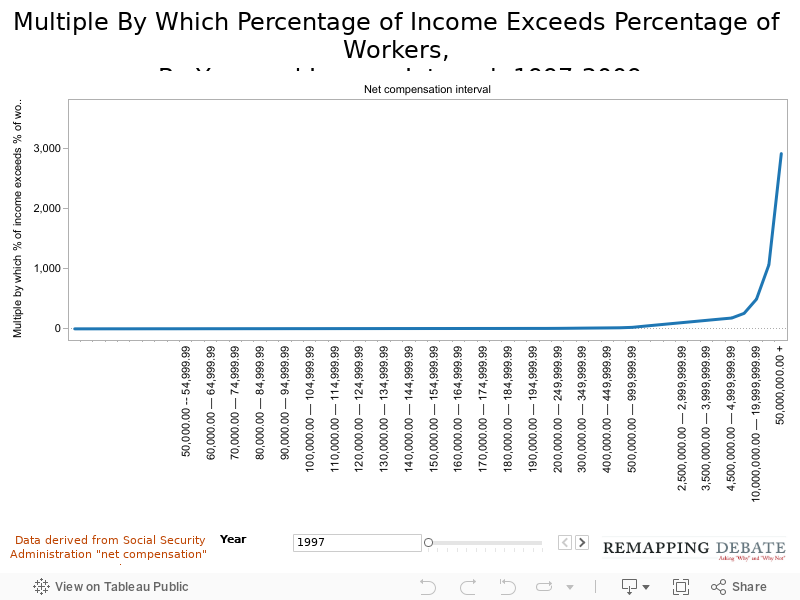
On this chart, we show the factor by which the percentage of income in the band exceeds the percentage of workers. To accommodate the $50 million and up category, the vertical scale is compressed. Thus, for example, the multiple in 1997 for the $200,000 to $249,999 band is a factor of 8, but is barely discernable because of the rise that begins to accelerate in earnest at the $2,000,000 level (percentage of income 84 times percentage of workers), and culminates in the $50 million and up level (a factor of 2, 912).
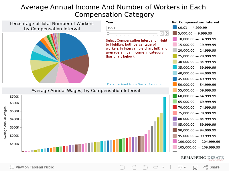
On this chart, the bar graph shows average annual wages by compensation interval. When selecting an interval (most easily done via the list on the right), the pie chart reveals the percentage of all workers in that income interval. Once again, the scale of difference at higher income levels does not permit levels at the $1 million and up mark to be depicted on the same visualization.
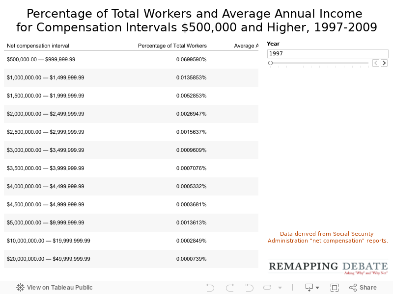
Sometimes, the best visualization may be doing it the old-fashioned way. This table begins with the income interval that, on the previous chart, was the highest income level. But here, as the percentage of total workers rapidly declines (seen as more zeros to the right of the decimal place), the average annual pay rapidly rises