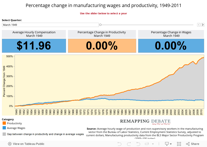
Jan. 25, 2012 — How much of the gains in manufacturing productivity in the period after World War II have redounded to the benefits of workers as reflected in their compensation? Until the early 1970s, growth in wages closely tracked growth in productivity. But as the graph below shows, an increasingly large gap between the two has developed over the last 40 years.
Using data from the Bureau of Labor Statistics, we compared each measure in each quarter to a 1949 starting point. When percentage change is plotted, the result is striking. While productivity has skyrocketed, especially in the last forty years, average wages have risen only 58 percent, and nearly all of that gain happened before 1970. This is what economists refer to as the “wage-productivity gap.”
Contrast this graph with two side-by-side graphs (one looking at productivity, the other looking at compensation) presented recently in a Wall Street Journal column. Because those graphs do not measure percentage change and are not plotted on the same axis, the tremendous divergence (while referred to in the text) is visually muted.
Note: For our graphing, we used inflation-adjusted average wage data of production and non-supervisory workers (compensation data is not available in a format that can be plotted this way).