Data visualizations

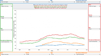
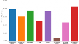
How white is Medicaid in Trump country?
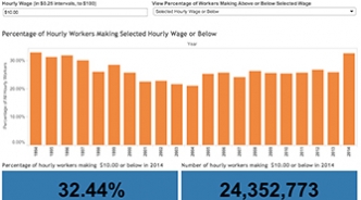
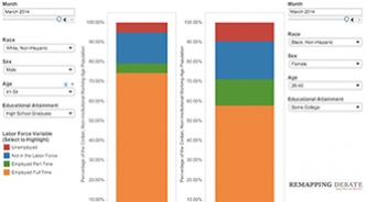
Medicaid cuts, which could result in millions of Americans across the country losing health coverage, may appear politically palatable to those who subscribe to deeply-held stereotypes about Medicaid recipients (and all recipients of state-administered “welfare” programs): they are mostly Black and generally live largely in urban centers. But look at what the data say.