Data visualizations

Get email updates and share our reporting
All our latest original reporting, data visualization, interviews, and more!
Major capital improvements in rent-regulated buildings: still landlord-friendly
The element of the system that has not been getting much attention is how landlords of rent-regulated apartments recoup costs for major capital improvements (MCIs) — things like new roofs, boilers, windows, plumbing, and electrical wiring.
Federal employment adjusted for population tells a different story
Even before any Trump or GOP Congress cuts this year, overall executive branch civilian employment as adjusted for population is materially down from its peak.
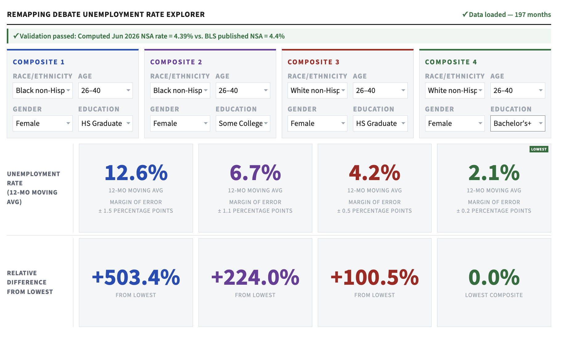
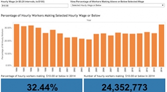
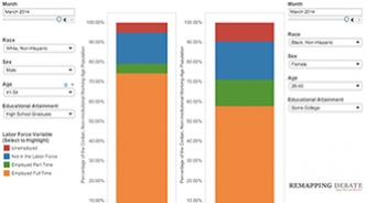
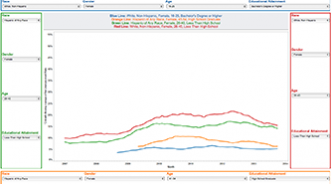
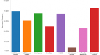
How white is Medicaid in Trump country?
Medicaid cuts, which could result in millions of Americans across the country losing health coverage, may appear politically palatable to those who subscribe to deeply-held stereotypes about Medicaid recipients (and all recipients of state-administered “welfare” programs): they are mostly Black and generally live largely in urban centers. But look at what the data say.

Oil and gas companies still enjoying 1920 royalty rates
When it comes to onshore production on federal land, that is.
Updated judicial vacancies tool: big reduction in median time to Senate action
Senate action on 20 pending nominations combined with 15 new nominations by Obama result in very different snapshot from six months ago. Will new picture last? Tools allow look at all judicial vacancies since 2001.