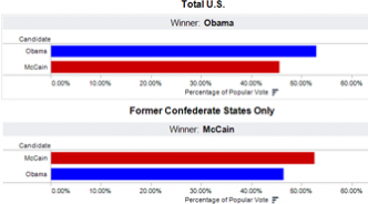
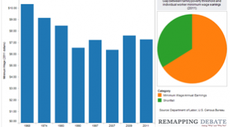
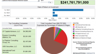
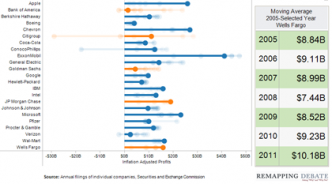
Data visualizations Popular vote for President: former Confederate states versus rest of U.S. By Craig Gurian Data viz shows results from 1968 to 2008, and reminds us of frequency of disparate outcomes. Elections Politics Individual minimum wage versus family poverty threshold By Mike Alberti Working at minimum wage earns you less in real terms than in 1968; you're further from supporting yo... Employment Labor Poverty Private consultants rake in public pension fund fees By Mike Alberti At many public pension funds, the fees paid to outside investment consultants are equal to a sizable... Pensions State government Bank profits: not so shabby after all By Craig Gurian, Mike Alberti There has been a lot of reporting in recent weeks about how big banks have fallen on hard times. One... Banking Back on top: new data show wealthy recovering more than others By Mike Alberti The top 1 percent of families captured 93 percent of total income growth from 2009 to 2010. Income inequality Taxes Eye-opening data vizes on corporate tax revenues, effective rates, share since 1946 By Lori Bikson Three new visualizations situate 2011 corporate taxes in context of entire post-1945 period. Corporate influence Taxes Obama seeks to lock in corporate taxes near historic lows By Lori Bikson Three new visualizations situate 2011 corporate taxes in context of entire post-1945 period. Corporate influence Taxes Producing more, earning less By Mike Alberti American manufacturing workers are more productive than ever, but earn less than they did in 1970. R... Economy Labor When the federal government dared to act By Margaret Moslander Viz shows scope, type of projects built in New York under New Deal's Public Works Administration. In... Infrastructure Role of government Aftermath of 2008 economic collapse: biggest global banks still...REALLY big By Mike Alberti 3 new visualizations on banks deemed "globally systemically important." Banking Underemployment state-by-state By Mike Alberti Easy ways to visualize not only the large numbers of unemployed workers, but underemployed, "margina... Employment NYC gov't staffing, 1980 to present By Craig Gurian Peaks and valleys across agencies and across the decades. NYC Pagination First page « First Previous page ‹ Previous Page 1 Page 2 Current page 3 Page 4 Page 5 Page 6 Next page Next › Last page Last »