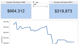
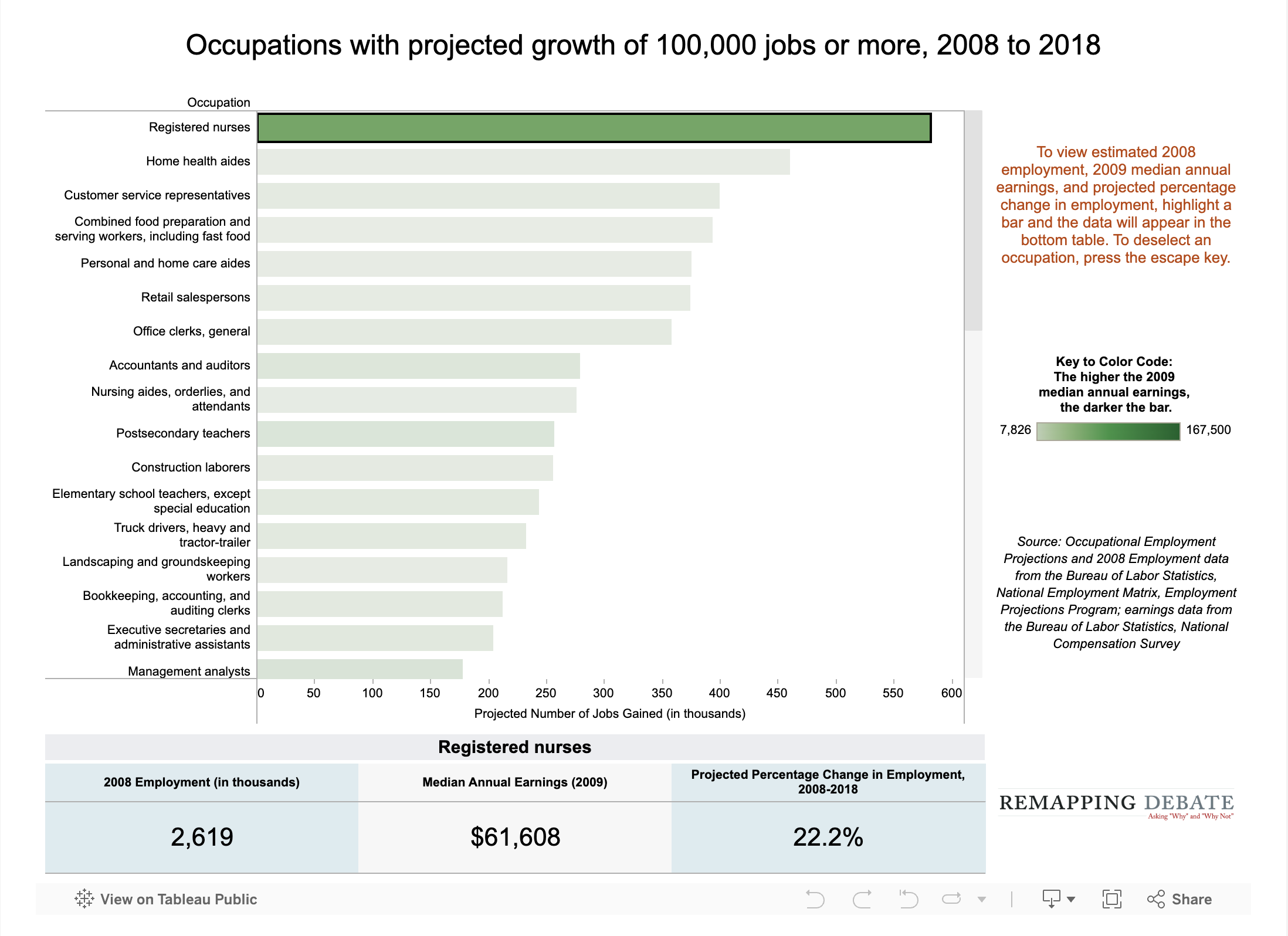
Data visualizations Win-Win or Win-Lose? By Mike Alberti Average hourly manufacturing production wages have languished in real terms for almost 40 years as i... Corporate influence Globalization Labor More U.S. kids in poverty than people in your state? By Craig Gurian Unless you live in Cal., Tex., N.Y., or Fla., yes. Number of children in poverty, child poverty rate... Children Poverty What expanding federal workforce? By Margaret Moslander When taking into account the growing size of the population, most parts of the federal civilian work... Government services Role of government Putting the new GM-UAW contract in historical context By Abby Ferla General Motors and the United Auto Workers just agreed on a new four-year contract. What began as an... Employment Labor Growing set of state abortion restrictions visualized By Althea Webber, Margaret Moslander Tools allow user to make custom assessment of impact in each state. Reproductive health services State aid to education down, down, down By Abby Ferla Our FY 11-12 data gathering is now complete, and we find 40 states effectively cutting aid over last... Education State government Who's been lobbying for whom? By Althea Webber Remapping Debate's new tools allow for a detailed view of the interests served by ex-lobbyists emplo... Open government Change in life expectancy in U.S. counties, 1987-2007 By Mike Alberti Gender equity Health Enhanced data viz on student performance By Mike Alberti Data from multiple years of test administrations now added to comparisons of subject, grade level, e... Education New tools permit custom analysis of educational attainment results By Mike Alberti Most recent U.S. Dept. of Education data made "slice-able" by grade, subject, and demographic variab... Education New interactive tool puts tax rates into historical context By Mike Alberti As Tax Day looms — and as Obama and GOP compete to cut tax rates — new tool helps make clear who has... Taxes "Good" jobs to be had in big-growth occupations? By Mike Alberti Government projections show 44 occupations that will grow by 100,000 or more jobs. Seven of the top ... Employment Pagination First page « First Previous page ‹ Previous Page 1 Page 2 Page 3 Current page 4 Page 5 Page 6 Next page Next › Last page Last »